Visualizing Smart Water Systems with AI & GIS
Apr 30, 2025· ·
1 min read
·
1 min read
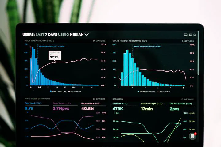 Image credit: Unsplash
In my recent work on hybrid AI models for water infrastructure, I needed ways to effectively explain system behavior, learning outcomes, and detected anomalies. Here are tools I used with HugoBlox to communicate those insights interactively and clearly.
Interactive Charts with Plotly
I used Plotly for dynamic visualizations of:
- Predicted vs actual pressure across nodes
- Leak probability heatmaps over time
- Consumption anomalies from SCADA time series
Save a Plotly .json file (e.g., leak-probability.json) in your page folder and display it like this:
graph TD
A[SCADA Data] --> B(GNN Inference)
B --> C{Leak Detected?}
C -->|Yes| D[Trigger Alert]
C -->|No| E[Continue Monitoring]
sequenceDiagram
SCADA->>GNN: Feed pressure data
GNN->>PINN: Pass edge/node outputs
PINN-->>SCADA: Simulated parameters
Note right of PINN: Feedback to SCADA control